Unison
Type — Scalable Platform & Design System
Role — Design Director
Company — Vox Media
Completed — May 2017
Unison was a platform-refactoring project, which migrated every Vox Media website onto one platform, built on a single codebase and shared design system. The project took two years to complete and involved more than 350 websites across our eight editorial brands.
Background
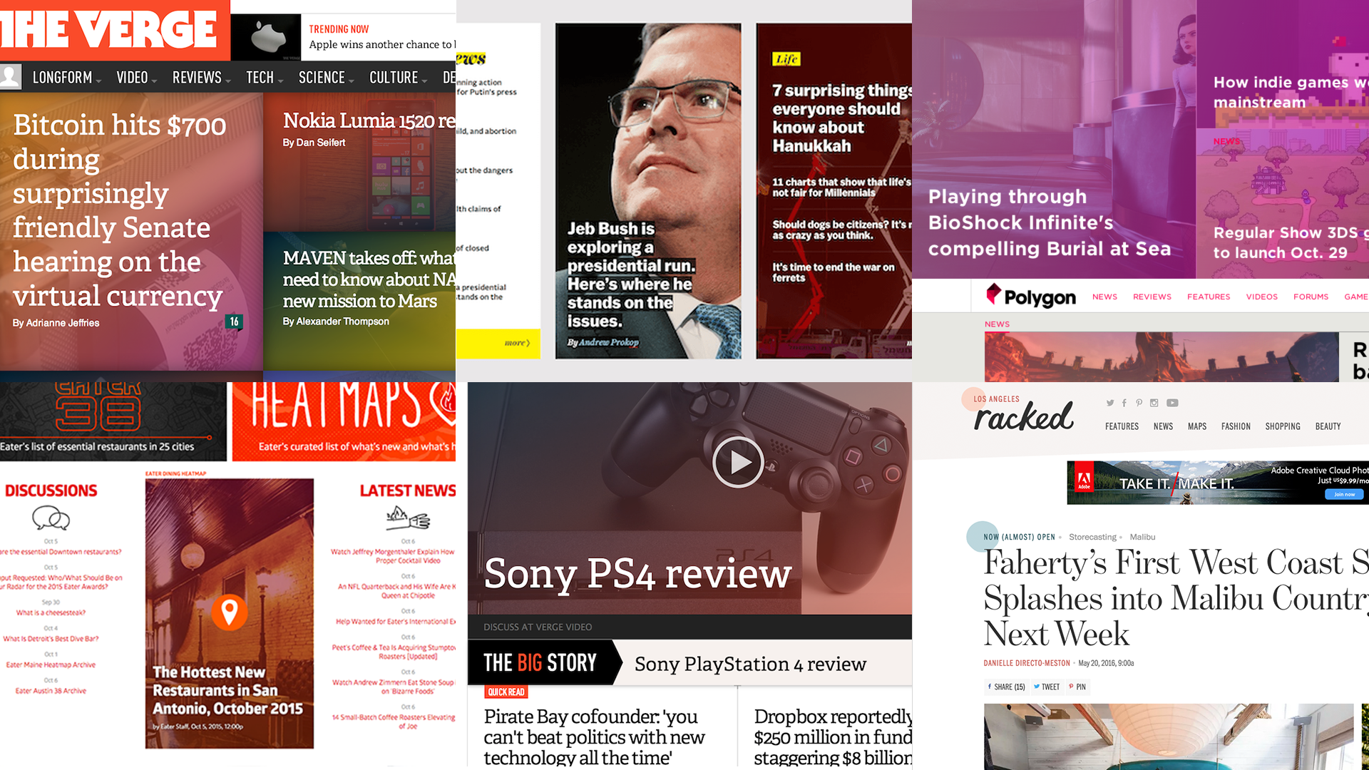
Starting with the launch of The Verge in 2011, Vox Media focused on creating brands that are highly individualized, both in terms of visual design and site functionality. Our brands were powered by Chorus’s (our content management systems) common set of publishing and community tools, but most of the presentation and user-facing functionality was custom-built specifically for each brand.
This approach made it hard to consistently iterate on our underlying platform. We needed to invest in making Chorus a platform on which media brands can be more efficiently designed, built, launched, maintained, and evolved.
So we built a more unified, highly-customizable Chorus, with a flexible set of design components that can scale for many different types of visual designs. With the click of a button, we can add a new Chorus site. We now have one unified set of publishing, community and advertising tools, contained within one singular, shared code base.
Design Challenges
As the Design Director over this work, the primary problem my team and I needed to solve was, how can we:
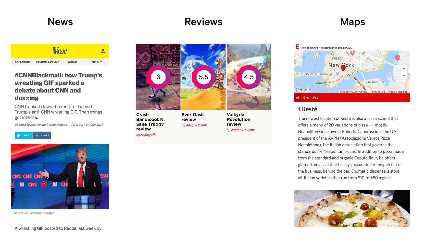
- Unify eight brand's various sites into one design and code system
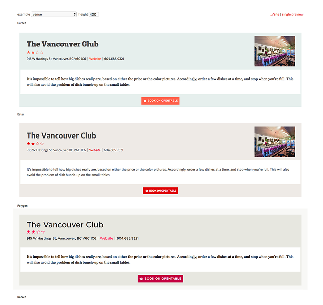
- Provide enough flexibility to allow brands to feel distinct
This was a challenging task because each of our brand's websites were incredibly distinct and full of custom components that ranged wildly from brand to brand. The visual design of our brand's sites was also bespoke—each brand had it's own typography, color palette, and visual elements.
In short, our design system needed to support different editorial missions, content types, audience needs, typography, and branding.
Creating a fast, unified platform
The first step was took was creating a fast, unified platform. Our primary principle for our platform was that it must be fast, accessible, and work well across devices. We also needed a unified core user experience so that our audience could travel seamlessly across all our brands.
We used data gathered from analytics and user surveys to determine what was most valuable to our audience across all of our products and used that to establish our foundation.
Scenario-driven design systems
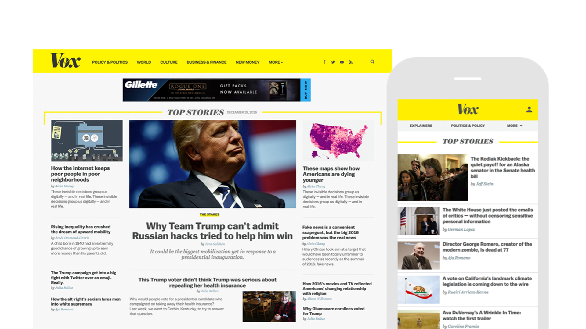
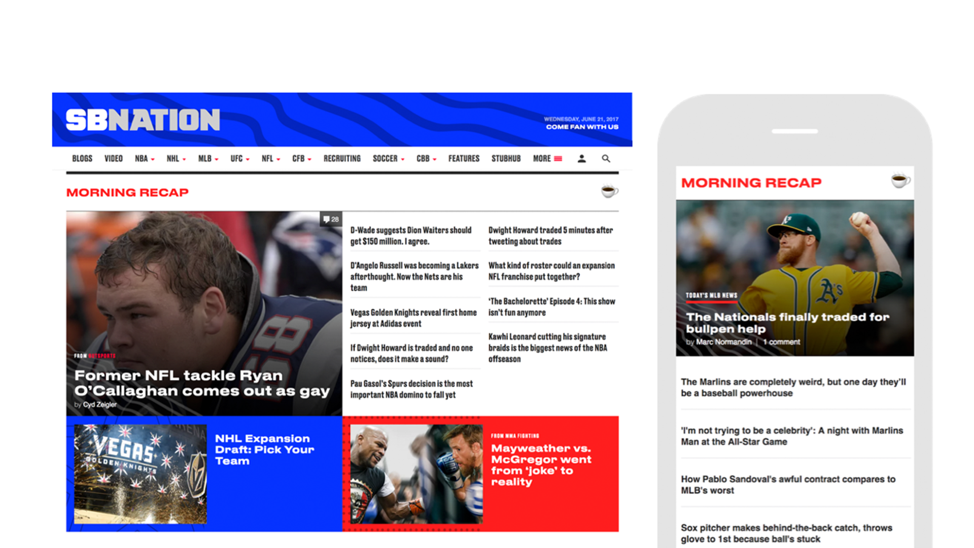
However, we shouldn’t be creating a one-size-fits-all solution. Also needed to give editorial teams the tools to customize user experiences based on scenarios. Below you'll see two scenarios we designed for: Newspaper— a text-heavy layout for busy news reporting and Morning Recap— for the morning after a busy night of sporting events.
Find key moments for brand expression
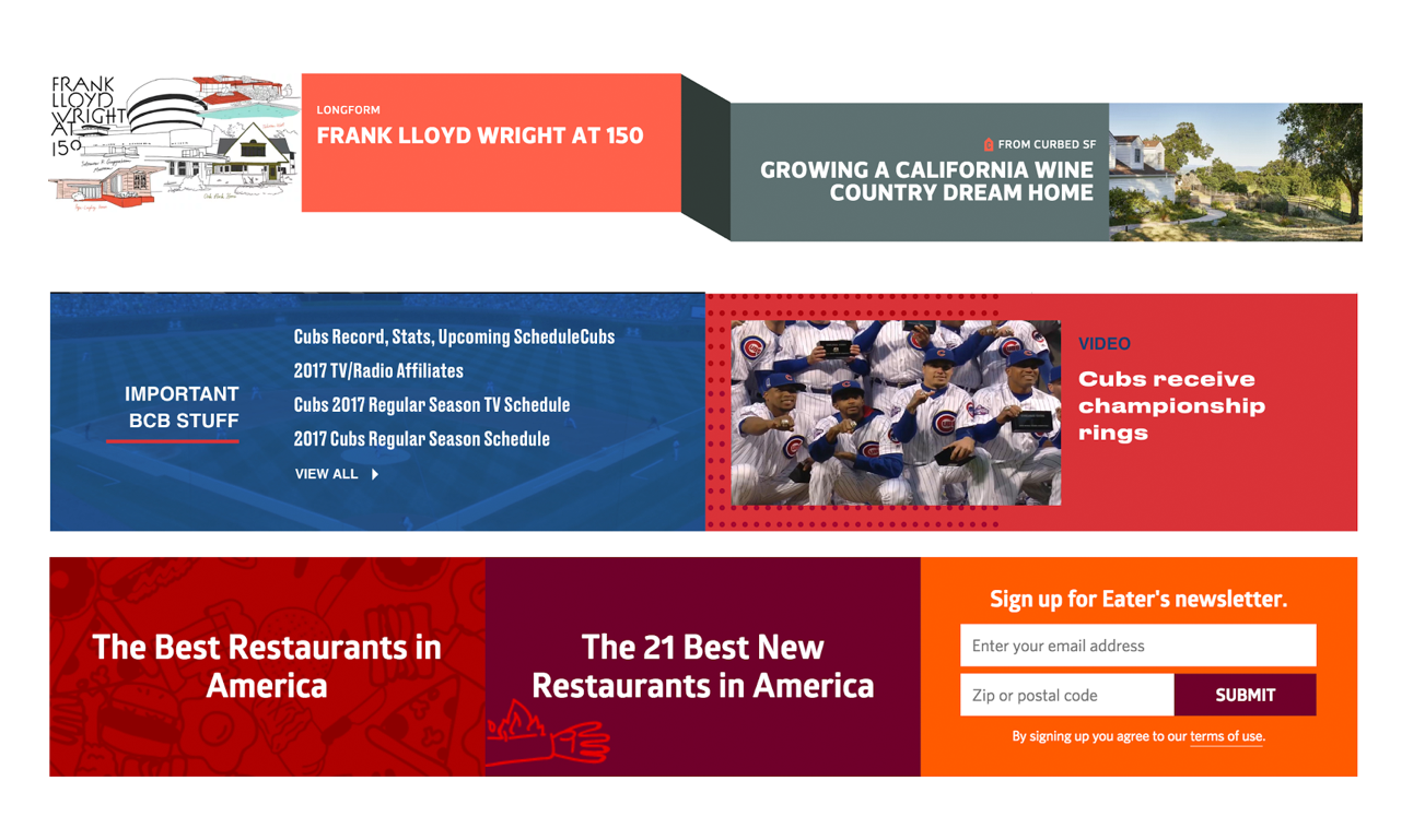
Brand experience is more than just colors and logo. For editors, the homepage should allow them to express their editorial voice.
Our scalable visual design system, which is comprised of foundational elements like a type scale, color system, and spacing variables, also has room for customization through scenario-driven presets. The result is that with a few configuration changes, we can achieve unique brand experiences within our unified platform.
Performance Wins
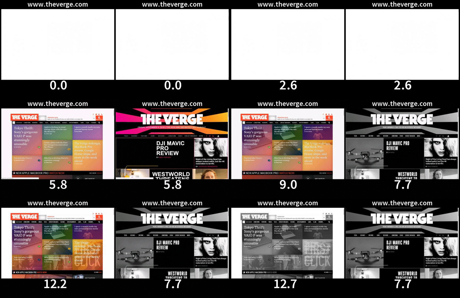
We've also seen huge performance wins on our new platform. Over the course of the past year, we’ve seen an average improvement of 59% in start render times across our sites’ article pages, and 32% in our speed index. As designers, we’ve been intentional with our use of heavy imagery and stick to a typography performance budget of 200KB per site.


