The Verge 3.0
Type — Scalable Platform & Editorial Design
Role — Design Director
Company — Vox Media
Completed — November 2016
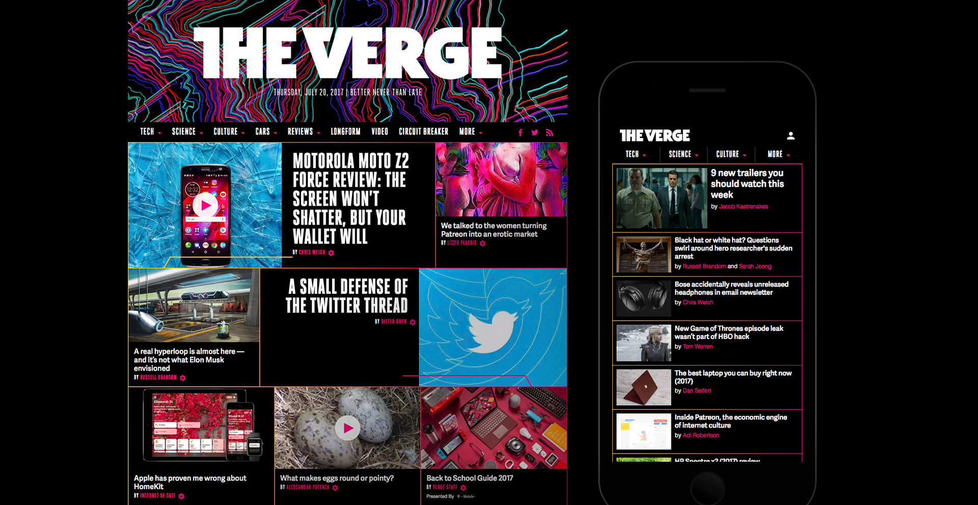
On its 5th birthday, The Verge relaunched with a new editorial mission, a refined logos, a new design system that extends into video, photography, and events, and new article, feature, and home pages built on Vox Media's new unified platform. My team was responsible for launching The Verge's website onto our new platform.
A New Homepage Product
The Verge relaunch coincided with our project to create a new homepage product for all Vox Media brands. After an extensive user research phase that involved user surveys, analytics, and qualitative feedback from our audience, we learned that our previous homepages were too hard to navigate and that our homepage audience is primarily interested in seeing the latest stories. To serve this audience need, the bulk of our new homepage product is a reverse chron feed of stories.
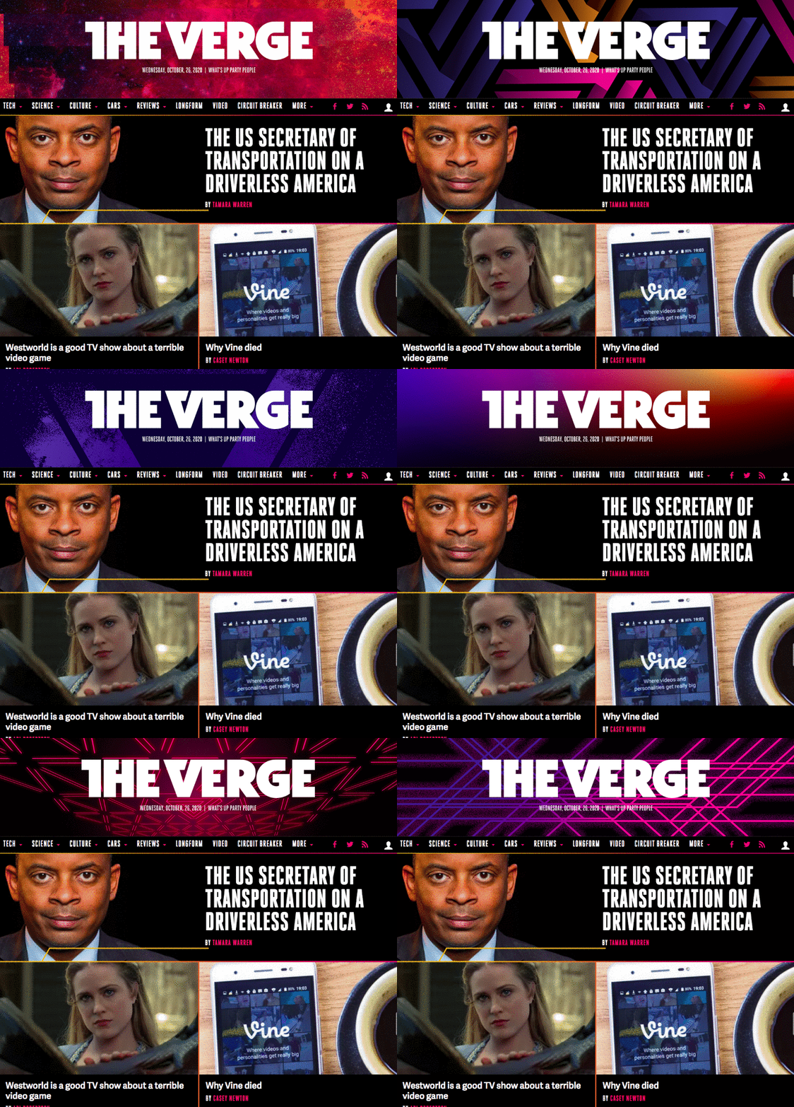
Of course, we also needed to make a strong brand impact and signal the most important stories of the day. We designed a masthead which the Verge team can customize on a daily basis and a new hero design with highlights their striking photography.
The result is an impactful homepage that allows The Verge team to art direct their homepage on a daily basis and helps their audience find the content they're looking for.


